A brand starting from nothing
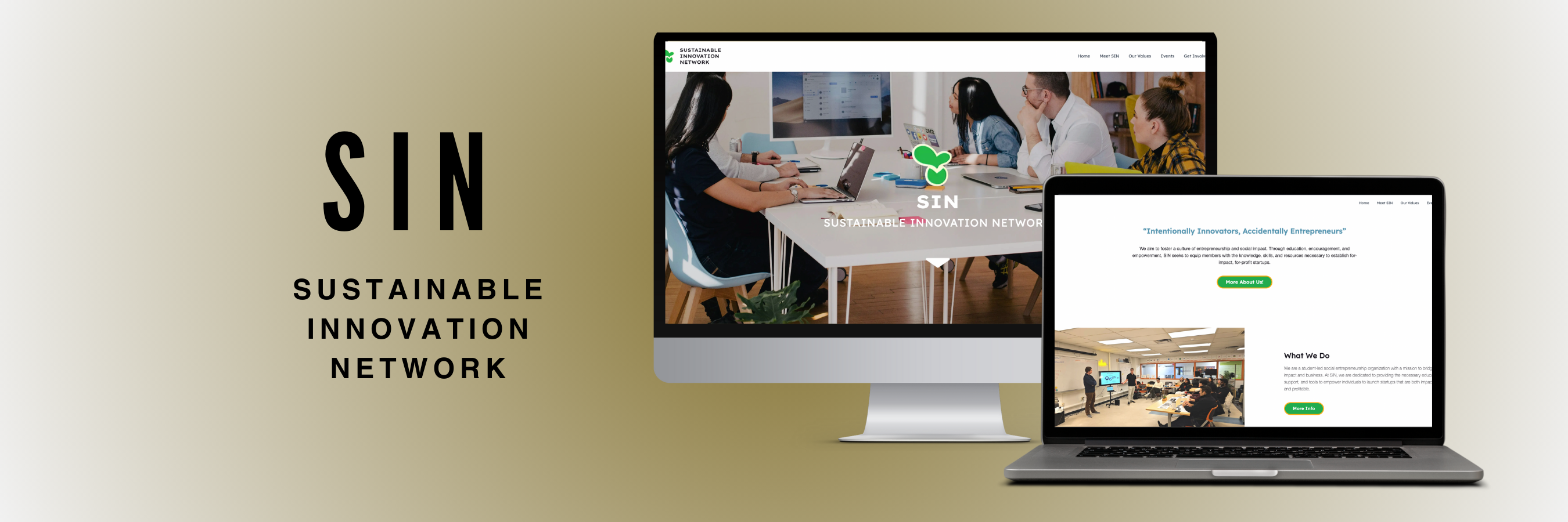
The Sustainable Innovation Network needed a whole brand from the ground up: a logo, a brand book and a website, so people would actually remember them.
The hard part was making sure everything looked and sounded like their values, spoke to the right people, and stayed consistent everywhere they show up. It was a really cool chance to build the foundation they would grow from.
Starting with research and the client.
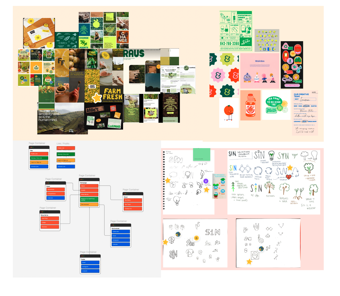
We started by looking at what other organizations were doing and meeting with the client to get on the same page about their vision, values and goals. From there, we brainstormed logo ideas and put together the sitemap and moodboard.
Competitive analysis
Four other Northeastern orgs we looked at, what they do well, and what we took from each.
Does well: every team has its own signature color that stays the same on the website and Instagram, so it feels quirky, fun and approachable, almost like a scrapbook.
We took: a broad but coordinated palette, and one symbol used across everything.
Does well: a really consistent black and white look, and a funny voice made for college students (their pitch workshop was literally called a “Rizz workshop”).
We took: the witty voice, but not the look. It can feel exclusive and intimidating, which is the opposite of what SIN wants.
Does well: bold color coding that stays consistent across their whole brand and website.
We took: using color on purpose, so every part of the brand feels connected.
Does well: a strong, simple logo and super consistent Instagram templates.
We took: a lesson. It’s more finance focused and the brand doesn’t have much personality, so there was a gap for something warmer.
What that meant for SIN
Lots of crits and lots of rounds.
Design critiques really shaped where this went. We kept iterating on the wireframes and refining the brand book with feedback from both our team and the client, before moving into hi fi and development.
Then I got to build it
I was on both the design team and the dev team, so after helping design the site, I got to help code it too, using HTML, CSS and JavaScript, with Git to work together and Netlify to put it live.
Who made it
- Albee Mote
- Xin Li
- Rachel Chen (me)
- Vanessa Balin
- Gabrielle Schwarz
- Madison Lebiedzinski
- Grace Uecker
- Yuni Park
- Rachel Chen (me)
- Maddie Lebiedzinski
- Heidi Eren