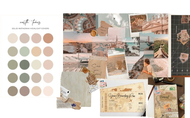
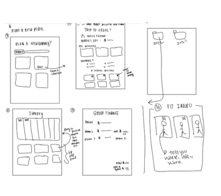
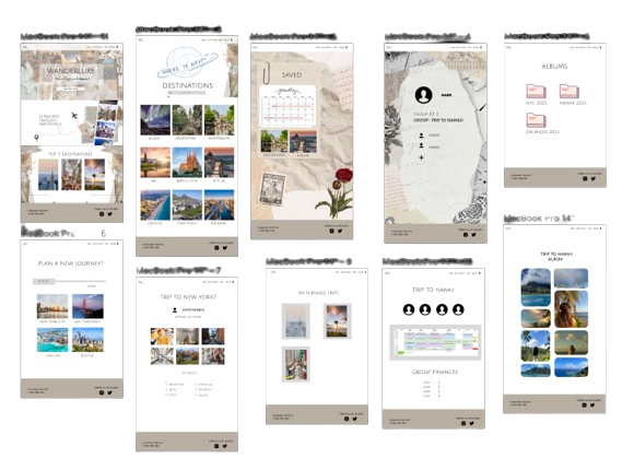
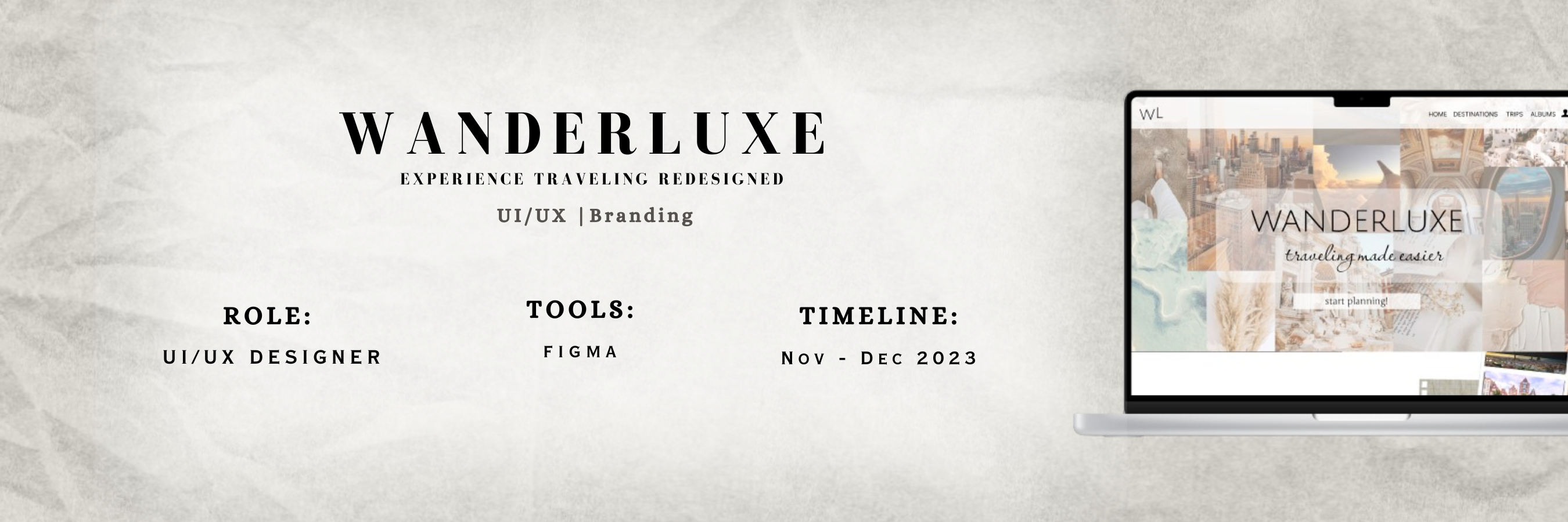
High Fidelity Presentation

1. IDEATE

    Problem:

  • college students usually like to travel on a budget
  • hard to collabrate with friends about finances and trip details
  • photos get lost in collections and is shoved deep in your phone

    Solution:

  • filter out and cap a budget to find a spot that works well for everyone
  • be able to add friends into the trip and share finances throughout the trip
  • users are able to create an albume for each location and share it. No followers, just for documenting the trip.

2. COMPETITOR RESEARCH

    Lonely Planet:

  • pages were too lengthy and wordy
  • overwhelming due to the influx of information
  • really liked the use of images and videos

    Let's go:

  • good use of the nav bar and good info
  • don't like the aesthetics of the site
  • main page takes too much of the space, not user friendly

3. MOODBOARD

  • wanted the vibes to be like a scrapbook since half the mission is to document the trip
  • through warm and pastel tones, it gives an exciting and lively feel, perfect for traveling.

4. WIREFRAME

  • first few ideations
  • many different sketches and lots of brainstorming.

5. High-Fidelity!

  • Using Figma, I created a high fidelty wireframe of the site. I incorporated photos and different elements to make the website design that I envisioned.